


Calculating TV Return on Investment At Scale


Introduction
Earlier this year, Simulmedia guaranteed a higher Return on Ad Spend (ROAS) from our TV campaign compared to their base plan. To measure this, our Business Outcomes product is able to directly and anonymously match Set Top Box Households to client purchase data and reveal insights into how TV advertising affects sales.
The Science team was tasked with coming up with a methodology to accurately calculate Return on Investment (ROI). The most straightforward approach to calculating ROI is the Randomized Control Trial (RCT). RCTs rely on random assignment to isolate the effects of treatment (in this case, exposure to a campaign ad).
Unfortunately, RCTs are not a viable option in the TV landscape. We are not able to randomly determine which Households see an ad and which do not. Because of this impediment, we needed a technique to replicate the RCT on TV at scale. For this, we have developed a control methodology based on the Inverse Propensity Weighting (IPW) technique. The IPW technique is an observational method (sometimes also referred to as a field experiment) in which the audience is classified into exposed and unexposed groups as occurred naturally. It was originally implemented in digital advertising, replicates an RCT, and works well at scale.
To properly explain the technique, it is helpful to first go over the intuition and reasoning behind why IPW works. After that, I will go into the actual math behind the technique and how we apply it.
Intuition
Campaign Effect


The equation above defines the effect that the advertising campaign had on the advertiser's desired outcome. E stands for Expected Value and is the average across all exposed households, and Y is each household's outcome. This can be binary, as in did/did not make a purchase, or it could be continuous, as in total spend. Y0 is each household's outcome given no exposure to an advertisement, while Y1 is the outcome given exposure to advertising. We already know E(Y1), which is simply the average outcome for each of the exposed households. However, we do not know E(Y0), or the average outcome of the exposed households if they had not seen an ad. This is also known as the counterfactual. An incorrect approach to estimating the campaign effect would be to use the average outcome of the unexposed households as a proxy for E(Y0). This approach is incorrect because of selection bias. The exposed group is inherently different than the unexposed group because the exposed group was targeted. In an RCT, we do not have to worry about selection bias because each household was randomly assigned to each group. The randomness removes any selection bias.
Overview
With an observational study, we are left with an unexposed group that is inherently different than the exposed group. If we tried to estimate ROI by using the raw values of these groups, we would come up with an incorrect ROI.
The idea behind IPW is to weight each of the unexposed households according to their probability of exposure to a campaign ad. Every household in the unexposed group could have been exposed to an ad, each with a certain probability. Intuitively, these probabilities tend to be lower in the unexposed group than in the exposed group (that's the selection bias). While leaving the exposed group as is, IPW weights the unexposed group according to their probability of exposure to the campaign. Households with a higher probability of exposure are given larger weights, and thus represent more. The opposite is true for households with a lower probability of exposure. A visualization of this is below.

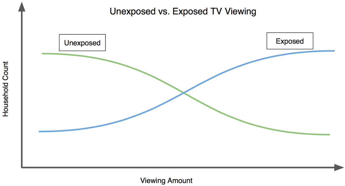
This graph shows the selection bias: there are relatively more light TV viewers in the unexposed group and relatively fewer heavy TV viewers in the unexposed group. As the graph indicates with the arrows, IPW pushes the count of the former down and pushes the count of the latter up so that the green line will align with the blue line. Why? The unexposed households that watch little TV tend to have smaller probabilities of exposure to an ad, thus their weights are smaller and the weighted count is decreased. The unexposed households that watch more TV tend to have larger probabilities of exposure to an ad, thus their weights are larger and the weighted count increases. Below is a different way of looking at the selection biases, but with data from an actual campaign we ran:

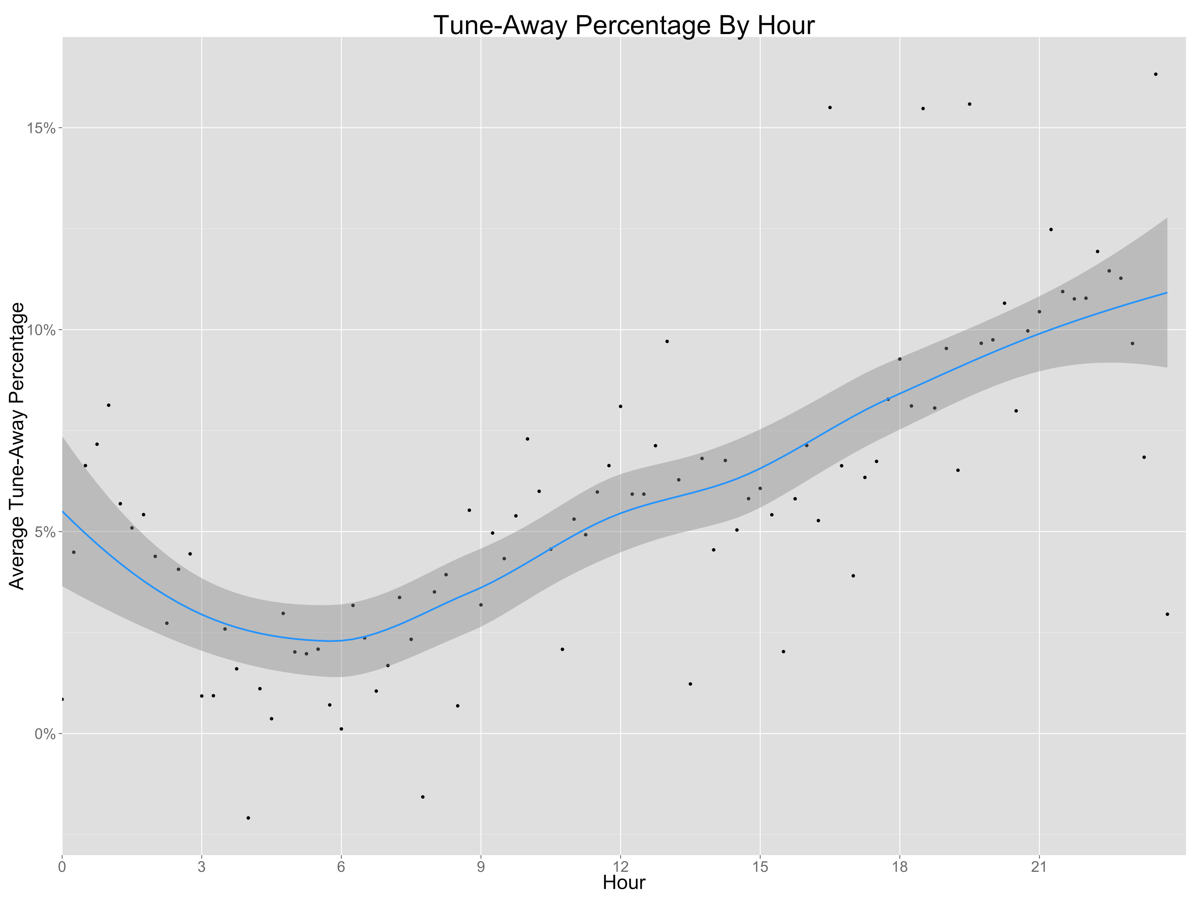
The above graph is created by first finding the TV viewing duration of the exposed group for each percentile, 0-100. These values are then divided by the TV viewing duration of the unexposed group for the corresponding percentile. For example, at the 50th percentile (the median), the y-axis value is about 2. This means that the median viewing duration for the exposed group is twice as large as the median viewing duration for the unexposed group. IPW corrects for this bias. After applying weights to the unexposed group, we should see the blue points line up neatly along the green line. The green line is along the line y=1, and means that the exposed and unexposed durations are equal for each percentile.
Methodology
Controls
Throughout this post, Ive been writing about the exposed and unexposed groups. This is actually a little misleading. Instead of using all unexposed households, we take a subset of these households, called the control group. The control group includes households that: 1) did not see an ad and 2) watched TV during a network/day/hour slot when a campaign ad aired. The first is obvious: we need households that were not exposed to the campaign. For the second requirement, we only want households in the control group that had the potential to see a campaign ad. If a household never watches TV on networks/hours that we aired the campaign's ads, then we don't want to include them since they will never fall into the exposed group.
Propensity Score Calculation
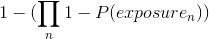
A vital piece of the IPW technique is calculating the propensity scores for each household in the control group. These propensity scores represent the probability of each household being exposed to the campaign. Exposure can mean that the household saw one campaign ad, or it could mean that the household saw 1000 campaign ads. The propensity score can be rewritten as:

This, in turn, can be written as:

This equation requires calculating the probability of each household in the control group of seeing each ad that aired for the campaign.

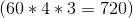

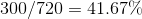
We use past viewing behavior as a proxy for probability of exposure. For example, take an ad that aired on ABC on Wednesday at 4:32PM. If a household viewed 300 out of the possible 720 minutes of that network/day/hour in the past 3 months , then we would assign that household a probability of of viewing the ad. This is done for each household/ad combination, then plugged into the propensity score equation above to come up with a probability of campaign exposure for each household.
After we have a propensity score for each household, we can then plug it into the IPW equation, which is written below:

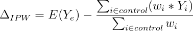
where:

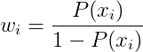
This looks similar to the campaign effect equation at the beginning of this post. The first term E(Y1), the average outcome of exposed households, is unchanged because we already know it. The second term replaces E(Y0). It represents the IPW estimate of E(Y0). The weights for each household (wi) are calculated as (p/(1-p)). The movement of probability of exposure in tandem with the size of the weight can be seen by plugging in probabilities to the equation above. The values 0.25, 0.50 and 0.75 illustrate this well.
While the equation for the IPW estimate appears to be complicated, it is actually relatively simple. If we rewrite it, it becomes clear that it is a weighted average, where the weights in the average are the propensity weights we have been discussing.

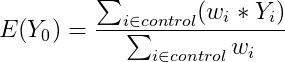


So, we have just calculated the average outcome of the control group, where each household's outcome is weighted in proportion to their propensity weights!
Conclusion
To ensure that everything is working, its important that we redraw the percentile ratio graph above with the weights applied. If the approach is working correctly, then the points should lie across the line y=1. Below is the redrawn graph from the same campaign as above.
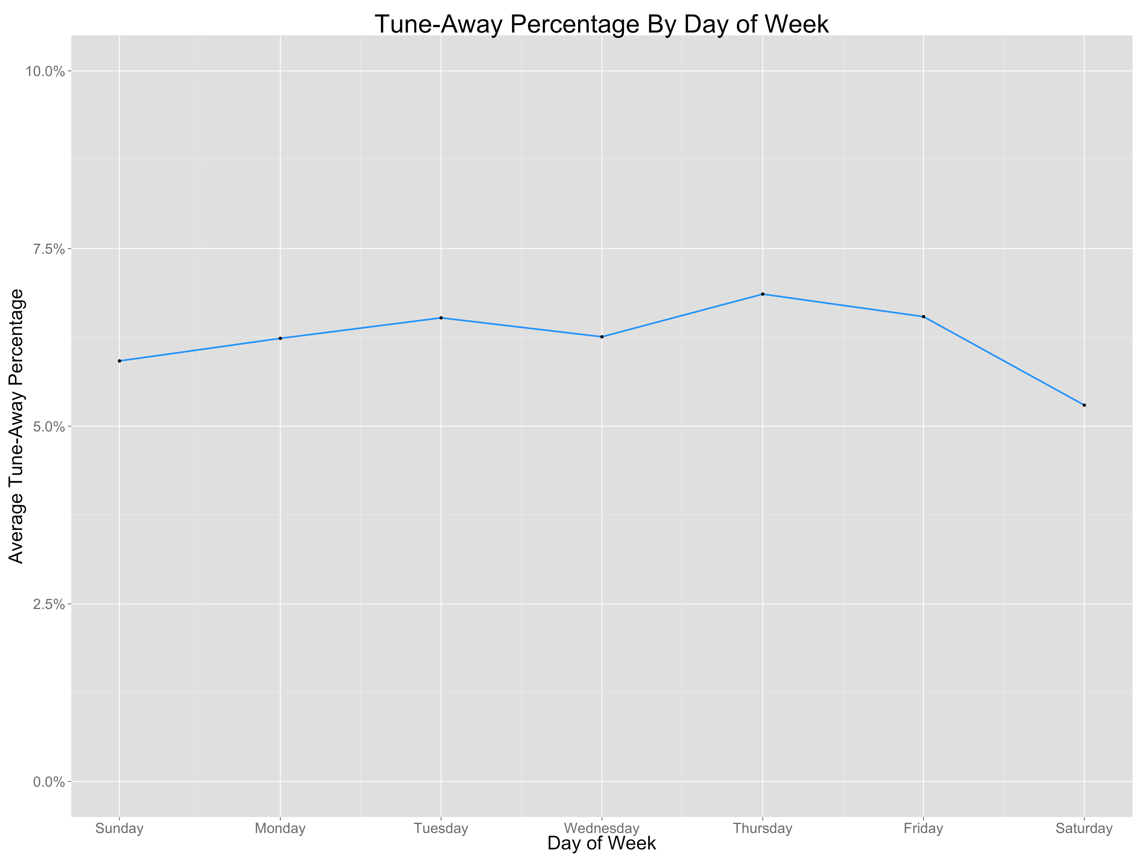
Exactly what we're looking for!
We decided on this approach for a number of reasons. First, it is commonly used with extensive previous literature around it. We didn't want to reinvent the wheel, but instead adapt a technique that has been used in other contexts and apply it to TV. Second, this technique works well at scale. With IPW, we are able to translate all of these steps into a Python script. Instead of making a very manual calculation, we can check that the assumptions of the model hold up with the data we are inputting, then run it through the script. These reasons allow us to implement a method that is both tested and extensively researched and will work well in a automated measurement pipeline.